Friday, 15 April 2011

Evaluation Six.

Technology used when creating magazine.

I used a dell studio laptop, when writing my article and editing some of the photos used and carrying out a lot of my research. I didn't really learn much as I already knew how to work the programs that I used.


When I took my draft and final shots I used this cybershot camera to take them. I found that the images I took were of really good quality and looked really good. I learnt that I could take some really interesting shots by changing the effects on the camera.


A program that I learnt a lot from was photoshop elements as I could edit my photos to create effects that suited my magazine style. I could also move my magazine around with ease until I found the look I thought was best. 

Not only did I use the school computers and my home laptop I used a macbook to use other programs that I could edit my photos on. I learnt quite a lot -although I didn't use it that much- but I used adobe illustrator to try edit some of my photos. 


I also used blogger, Scribd and slideshare when uploading images, articles and research.

evaluation Five.

Addressing and attracting the audience.

FRONT COVER:

The use of a strong main title/ logo can attract the audience as magazines such as NME have built up a name for themselves and even when it's covered over it is still easily recognizable. With my title, I wanted to create a similar effect and so had a simplistic logo that could be easily recognizable and would attract the audience.


When attracting the audience to the magazine I used a simple cover line that fitted in well with my magazine, as it was the same colour scheme/ fonts etc. The image I used on the background of my main page has high contrasting colours that attract attention. Also, my models eyes are very striking in the image which directly addresses the audience and makes it seem more appealing. 

The use of a good colour scheme throughout the front cover makes the magazine more professional and attracts the target audience as this is the sort of thing that they would look for, on mine I have used a simple black and white font. I havn't overcrowded the front cover which makes it look more appealing to the audience as well as more intriguing as the cover lines and quotations are quite subtly attractive. 


CONTENTS: 

The contents attracts the audience as it is simple yet has features that would interest the target audience. 
The choice of just using one photo attracts the audience to that particular point and does not look over crowded and unprofessional. the image used is an attractive image of Kog, which is aesthetically pleasing to the reader.


The artists and other features that are listed in the contents are attractive to the reader as the features listed all relate to the audiences preferences and music tastes. 

Evaluation Four.

Target audience.

My target audience for my magazine are adults between 16-24. Specifically, my audience will be the broad label of 'Indie/alternative'. 
Things that my audience may have are a specific music taste, such as a more unique taste that can fit into the alternative music scene. They will be interested in new and upcoming music that they would find in magazines such as this one, and also want to go to gigs regularly which is something that magazines such as this one promote. The typical clothing worn will be from vintage shops and high street places such as Topshop, as these shops are stereotypically associated with this style of music. 
The look I have gone for within my magazine targets my age range as it has quite a mature image with writing that includes swearing within it, this is why I have gone for an older audience that would be interested in it. 

Evaluation Three.

Media institutions that may distribute my media product.

Companies that would distribute my style of magazine would be similar to NME and SPIN as these both have a very similar genre of music throughout the magazine,  and also have a very similar target audience. I think that the similarities between other magazines I did my research on, such as VICE who fund themselves through advertisement in their magazine. My magazine could also get a lot of its funding through advertisement throughout its pages. The distributor of my magazine will want to distribute it as it is an unusual style of magazine that will interest a large audience and introduce new bands and have a unique style. 

Evaluation Two.

Representations of a particular social group. 


The type of social group my magazine is targeting is quite clear as overall the magazine has quite a simplistic yet strong look to it which makes it seem quite professional, this type of look only interests a certain type of social group as some people may find it too 'serious' looking. i.e. no bright colours and the pages not completely rammed like magazines such as Metal Hammer magazine which target other social groups. 


In relation to other bands I think that Kog can be compared to artists such as Alice Glass for her 'different' kind of style, alternative attitude and interest in a unique style of music. Kog has a similar style which is portrayed through my magazine, this would entice a certain social group as they want to keep updated on the latest interesting styles of music and looks. ALthough there are many differences in their image in this particular picture you can see quite a laid back look of both artists and even the backgrounds are similar which i think make the similarities of the target social group obvious. 


Another artist Kog is similar to is Lykke Li, her music is quite origional and in this particular image the clothing worn is quite similar which can target a certain audience and social grouping. The choice of making Kog seem more laid back and interesting is a way of getting this particular social group interested, as they want to read about her because of her image and attitude towards music. 

Thursday, 14 April 2011

Evaluation One.

1. In what ways does your media product use, develop or challenge forms and conventions of real media products? (i.e. of music magazines)


Title of your magazine.

1. When thinking about the title of my magazine, I took into account the genre and style of magazine I was trying to achieve. I looked at other magazines that targeted a similar audience and tried to come up with a 'catchy' name that was simple and musically related. The name 'FOLK' could be perceived in many different aspects, for example not only the genre of music but also the association with people, folk is used as a word that refers to a group of people. This was one of the reasons why I really liked the title, as not only was it short and catchy but it could also be seen as a 'peoples magazine' designed for people who enjoy music. Also, in the two magazines I did research on (NME & SPIN) I really liked the simplicity of the colour scheme of their titles, and wanted to do a similar sort of colour palette so that the image on the front wasn't overlooked completely by the title. However, with the title being quite large and simple on the front, it is still very attention grabbing to an audience.


Graphology and page layouts.

2. The choice of layout for my magazine stayed the same from my draft to my final product, I liked the way I layed mine out as it was slightly different from the typical conventions of 'white background with the person on'. The image I chose filled up the page and the choice of setting unuasally works for the genre of magazine I have produced, the choice of the countryside background and the clothing worn, I think fits in really well with the title 'FOLK' as this is commonly associated with countryside etc. The choice of colouring and editing through the photograph really makes it stand out and appeal to an audience.I wanted my magazine to have a similar look to it as magazines such as 'VICE'. I layed out the page using conventions I had learnt from researching other magazines for example the use of a cover line a the top to get the audiences attention when on the shelf, I also included other advertising techniques such as a circle on the page reading "special guests and features". I didn't want to put too much text onto the cover as I didn't want to over crown the page with it already having an image that has alot of detail in it,so instead chose a few main subheadings and placed them down the left hand side so they didn't overlap the 'star of the page'. Although my main image had a lot of colours in it, the writing all stuck to the three colour palette rule so it would look more professional.


costumes, props, iconography used to reflect genre.

3. The choice of clothing that I put on my model was slightly alternative and this links in with the genre of my magazine and also the title of it, as the word folk is commonly associated with a countryside/farmer stereotype, which is why I think that the use of the checkered shirt works well to add to this style and look. I didn't really use any props in the final product as I thought that the simplicity of her look and the use of the chosen back ground would be enough to keep the image interesting without over complicating it. This style of image


Camera work and images.

4.  When I took the images for my magazine, I took a variety of styles but mainly focussed on the model and the background chosen (countryside) I really like how detailed the images were but also how they made the model stand out in comparrison with the rest of the page. The contrasts in colours after I edited the photos make the page look very striking I thought in comparrison with the origional shots, this would be something that would interest the audience when browsing in a shop. When I was taking the images I tried to make some seem very natural however, some I wanted to be posed so that I could edit them later. I also chose a simple image with just a plain background for the double page spread and overlapped it with itself to create a blurred effect on the image. 


Article, header etc font and style. 

5. The chosen style of fonts i went for were very simplistic and bold, i used these to create quite a strong image for my magazine. I also used a very 'scribbly' sort of font for the subheadings on my cover this was so that my magazine cover didn't seem too serious and broke up the boring use of one font. When writing my article I thought about the genre of magazine I had aimed for and decided on the style of speech 'Kog' would have, I chose to go for a quite informal and unserious frame of mind in the article. 


 How the magazine Cover, Contents and Double Page Spread represents my genre.

6. throughout these 4 genres there is a constant theme of things that not only links them all together but ties in well with my genre of magazine. There is a constant use of fonts throughout it along with a specific colour palette that suits the style of magazine. The fonts I have chosen are all pretty simple which is why they link in, because the research I did on this style of magazine tend to stick with simplistic fonts and colours to create a strong image. The choices of photos throughout them all, tie in all the pages and create quite a simplistic and alternative/indie style of magazine which is what my magazine genre is. The chosen items of clothing worn throughout, are all clothes that may represent the more alternative/indie look which is the style I was going for. 


How the artist is represented.


7. Throughout my magazine I have represented my artist as quite a trend setting, laid back character which is how I wanted the artist to seem even through the photos. Her clothing is slightly unusual and different which to the eye makes her seem more 'alternative'. Kog's attitude is very strong yet also very laid back, for example on the cover there is a lot of swearing to stress her opinion, yet her thoughts are of how she doesn't care what people think of her music are there and are obvious. This is exactly the character I was going for as it could be seen to be quite 'rebellious' and it's quite similar to artists around now such as Alice Glass who are pretty iconic to the sort of target audience.


Colour scheme. 

8. Going from my draft to my final magazine my colour scheme has not altered too much, it has wavered slightly and mainly sticks to two colours, black and white to give a simplistic, bold and strong look to the magazine as well as making it look more professional. However, the magazine also includes a third colour throughout some bits, which is a deep red and is used on some of the writing in the magazine.

Tuesday, 1 March 2011

Final photos

I took some more photos of my model for my final magazine, however, I have not used all of them in my final one, as I think that the mock photo I have taken on my front cover is good enough. The photos I have taken this time round are much clearer and detailed and a may photoshop them to look as though they have a good effect on them. Here are the photos I have taken...


Wednesday, 23 February 2011

Draft Evaluation Feedback

From my feedback I will adapt my magazine slightly in a few areas and change quite a lot in others in order to make it look as professional as possible. There are a few simple things that will make it look a lot less messier, and i will also change a few things that I will change drastically.

My front cover doesn't need much changing, the front image relates to my magazine title and genre well so I am going to leae that. However, the rest of my front cover only needs a few small changes to make it look as good as I think it can, for example, it could use a few alignments to make all of the text line up and look professional. Also, the barcode could do be slightly smaller as it it too large on the page. Other than these changes I think that my draft front cover will be good enough as my final hand in.

The feedback I have received on my contents, I would agree with quite strongly. My draft contents looks unfinished in comparison with my other pages. Due to this I think I need to drastically change my contents layout and also adapt it to fit in with my genre and the style of the other pages. I.e colour schemes and picture style. I think if I go for the same style of magazine I have been inspired by I definitely need to fill my contents up more, to make it look more interesting and professional.

My double Page Spread, only needs a few minor changes such as alignment and sizes to fit the page. My article needs to be slightly longer to fill the page up and not make it look awkwardly placed. However, if instead of adapting my article I could also put in another picture of my model, I could cut the image to include more skills to up my mark.

Sunday, 20 February 2011

Feedback sheet.

Name: Katie Bosworth 

Title: FOLK


Mood Boards
Yes
Examples of other texts/style models
Yes
Analysis of magazine covers
Yes
25 word Pitch
To Do
Pitch feedback
To Do
Mock ups
Yes
Test shots
Yes
Colour palette
Yes
Audience Profile
To Do


Comment:

Cover- Leave as it is!

DPS- Article needs to be a bit longer. Have your intro as a single block of writing.

Contents- Looks unfinished in comparison to contents and DPS. Maybe add 2 more pictures?
-          Take contents image again on a different back ground?


R & P Level:
2
Practical Draft Level:
Low level 4

Friday, 11 February 2011

Draft magazine


With my draft magazine, I think that all the pages link together with use of coloured back grounds and fonts. However, I think that my front cover and double page spread are the stronger pages and my contents is weak in comparison.

Sunday, 6 February 2011

mock ups

this is a mock up of the style of how i want my draft front cover to be. I have used the same layout, style and fonts as I will use. The 'look' of the front cover is definitely how I would like my magazine to look, the use of special guests and features isn't usually something I would go for, however I think that with this style it works oddly well.
The simplicity of the contents is what I like most about it, I don't know if I will actually cut of my model as sometimes I think it can look quite unprofessional. When I do my real contents  I will include more colours that tie in to my genre and the rest of the magazine. I may also include more than one image on to it, this I think would make it seem more full and interesting to the eye.


This double page spread is a very similar to how I will lay mine out, however I may do a quote over the picture to add more detail onto it to make the page look more enticing to the reader. The style of the picture isn't what i will put on the final DPS as I think I will use a picture with more of an interesting background. However, I will still use just one model and not a 'band'.

Tuesday, 1 February 2011

Draft essay

Foggbrooke are rising legends in the alternative indie rock scene, a cross between Caribou, grizzly bear and Everything Everything, this brings a new style to mind! Can this work?! Yes. Surprisingly so, Foggbrooke amazed many when they played on the introducing stage Reading/Leeds '10, grabbing passers by with their intriguing new sound!
Starting out with just a guitar in the basement playing together, smoking and drinking excessive amounts of beer, to smashing local venues with their new style of music and small fan base. Foggbrooke needed to break out of small town 'Lutterworth' and hit the music scene hard with their new sound. With new singles out such as ‘Sacred Wars’ and ‘Suburban express’ it's inevitable! They are a different style within this genre and with their lead singer being a woman they’re not just a typical band. Foggbrooke are like a rolling stone in the snow, slowly gaining a loyal and strong fan base, including current radio legends such as Zane Lowe and Annie Mac, with this sort of support, Foggbrooke are going places and going there fast! 

Hey Kog nice to see you!
Cheers, it’s good to be here.
Are you surprised and shocked to have made it this far already?
                Well, yeah i guess I am. I can’t really grasp it yet, but I’m so glad we have. I mean it’s weird ‘cause it feels like yesterday when we were just fuc*ing about in Toms’ (guitarist) basement making songs and getting pissed. Now people actually know who we are, it’s crazy. I think that this is just the beginning though, I hope we can get the most out of our music.
Would you say that the band has become much more serious of recent then?
                I think in some ways it has a little, like when it comes to actually making the record we try not to mess things up, but it’s not over serious, we still have a laugh whilst doing it. Well, it’s our career on the line at the end of the day if we do mess it up. We still spend alot of time fu*cking about, making songs and getting wasted though. *laughter*
So Kog, how does it feel to be the main man, or should i say woman in this new uprising band?
                It’s unreal! So many new things to get used to! It still baffles me that someone might know who we are when we go out... I love it though, and I know I can speak to for the rest of the band when I say we all do!
I expect with you being the only woman in the band you get all the male attention?
Surprisingly no, James (pianist) has a really large male fan base. Gentleman’s man. *more laughter* I’m joking, but no I don’t really notice any, if I do, I consider myself to be ‘one of the lads’ anyway, what with the rest of the bands being guys.
 How are you feeling about the debut release of your new album ‘Blue Coat Systems’ ?
                I guess I’m mostly excited, I can’t wait for it to be released! It would be sweet if people are into our album as much as our singles, we know our music is weird, but we like it and most of our fanbase like it that way too. I couldn’t give a f*ck if some pop DJ decides it’s shit, just as long as some people enjoy listening to it, we enjoy making it.
How does it feel knowing that you have other big popular DJ’s like Annie Mac and Zane Lowe fully backing the release of your new album?
                It’s immense, I couldn’t believe it when I heard. It’s good to know that we have support from people who can get us noticed by promoting our songs. It’s brilliant that they actually like us though.
A little rumour has been going around that Foggbrooke are going on tour, can you confirm this?
                Yes, I can. We’re going to start just before summer, and head all around the country and Ireland. Our gig list should be up on our site before the end of the week. We would love to do some festivals again this year, I mean that would be incredible! Personally I’d love to do Reading and Leeds again, they were nuts, it was such a laugh. In the future though,  Glastonbury is somewhere I wouldn’t say no to playing!
How was it for you playing at a festival last year? You played on the BBC introducing stage, and were very popular.
                The hype of everything at a festival is just brilliant anyway, even when you just go with your mates for the weekend...but actually playing in front of an audience there was amazing, everyone gets so into it, and nobody holds back I think that’s why I enjoyed doing it so much.
Would you say it was better than a normal gig then?
                I wouldn’t  say that as they are totally different atmospheres. At a festival people get more into it, and the atmosphere is so much more nuts and everyone is just doing their own thing. When you’re just playing a gig though, the audience get more involved and dedicated to the music. I love playing them both as much as each other!
Are you planning on doing another album straight the way?
                Well, we’re going to wait to see how well this one does first, but I expect that we will be writing loads on our tour and we have some we didn’t put on ‘Blue Coat Systems’. If this album takes as much as our singles, and people want more, we are happy to keep going!
Well thanks for meeting up with me kog, and good luck with the Album and tour! I’m sure it’ll be massive!
Yeah, thanks!

Monday, 31 January 2011

Mock Photos.

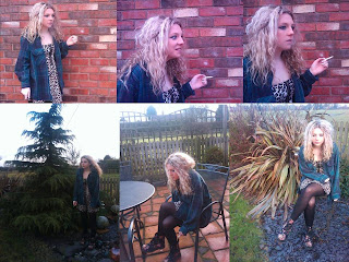
When I took the photos, I used a few different 'poses' for my model, this was so I could get a variety of angles and shots that best fitted the image I had in my head and also get shots that flattered my model the best. I also included a few props to some of the shots (e.g. a chair and a cigarette) these were added so I could try out other styles of photos. These photos I have taken have not been edited, however, the one (or more) I use in my final magazine will be edited to fit the style and genre I want to produce. The contrast, colour and brightness will be changed quite alot as I want my image to stand out and look different, as it is going to be the full image on the front cover (not a cut out). This is also one of the reasons why I have chosen the background in the shots links into the fact I am having my background on my cover, therefore I have picked something that links into my title and also looks interesting.


Friday, 28 January 2011

Photographic inspirations

I really like the photorapher Steve Gullick, as his work isn't just a plain shot of the artist, it includes an interesting background and I like the way his shots are taken. the images he takes also include interesting colours which I really like. Here are a few spefic images that could potentially inspire me to use on my front cover.
This image is one of my favourite from Guillick, I really like the dark style of photography and the colours that have been used. I think that the background is bright enough to contrast the peoples bodies and faces. Even though it is a darker style it is still enough to grab readers attention when on the front of a magazine.

I think that the mid-shot is brilliant in this photograph! I really like how the face is scrunched up, as it's not a typical perfect pose pulled.
I really like the contrasts and colours in this photo, they work really well and create an unusual and interesting effect. The background is interesting but does not draw attention away from the people in the photo. When I take my final shot I am going to take into consideration the contrast and colours in this photo and use them to influence my own image.


Wednesday, 26 January 2011

Articles and reviews

On my two page spread, I want to include a review on the band/artist on my page. For example, this review on James Blake is a similar style to how I would write it. http://www.clashmusic.com/reviews/james-blake-james-blake I like that it explains a bit about the artist. However, my review would not be quite as long as this, as i would like to also include an interview on my artist.

I like the 'question/answer' style interview, for example NME interviewing Dirty Pretty Things.. http://www.nme.com/blog/index.php?blog=10&p=5490&more=1&c=1 within my article i would like to include some questions on my artists.

I have decided that I want to put both of these styles into my article. For example, start with an introduction to the artist and include some details about them/her/him but then after a paragraph or two, try and do an interview, doing the question and answer style interview.

Tuesday, 25 January 2011

Artist names to be included in my magazine.

These are some of the names I have come up with to include in my magazine, for example the artist on the front of the magazine and also other artists within the conents or even the double page spread.

Groups/Band names

foggbrooke
Instruvenous
rhumspring
casino junket
Albert town

Album names

hurricane season
lego city
blue coats systems
common house martin

Monday, 24 January 2011

Style of music magazine.

The style and genre of music magazine I am going to try and make mine relate to is 'Indie/rock/alternative'. I want it to have a similar style to magazines like NME, Kerrang, SPIN, The FLY etc. I generally like this genre of music and so would find this easy to do research on and to try and reflect in my magazine. With these types of magazine they usually have a black/white/grey/red theme running throughout it, I really like this colour palette and will use this style in my magazine.

Friday, 21 January 2011

Magazine Title

The title I am going to use for my magazine is "FOLK" as I think this title generally sounds good as a music magazine, but also because it could be considered as musically related, as 'folk music' is a well-known genre of music. Another reason I like this as my magazine covers is that it could also represent 'people', which I think could make the magazine seem sort of 'what people want'.


This will be the one I use in my mock up and final Magazine...

Thursday, 20 January 2011

Heading Fonts and fonts for inside the magazine.

I really like these fonts for the heading of my magazine, as they are bold and eye catching. I especially like the second one down (Bebus neue) as I think it works best with the letters and I like how spaced out and bold the lettering is.


The fonts below are fonts I am thinking of using inside my magazine, either on my contents of my double page spread. I particularly like the bottom two as they are very different from each other, but could both work within my magazine because of their styles.